Role: Developer & Data Analyst
Status: Completed
Type: Data Visualization Project, BI Skill Expansion
Project Motivation
As an experienced dashboard creator highly skilled in Excel, I wanted to expand my business intelligence (BI) and data visualization expertise by learning Tableau. My goal was to explore how Tableau enables richer interactivity, deeper data exploration, and stronger visual storytelling compared to Excel dashboards.
This churn analysis project was a hands-on opportunity to sharpen my Tableau skills while applying familiar dashboard thinking. I chose customer churn because it combines time-based, demographic, and behavioral factors — making it an ideal topic to practice segmentation, calculated fields, filters, and data-driven insights.
Development Journey:
Learning Tableau with Purpose
- Built on existing Excel dashboard experience, translating familiar workflows into Tableau’s environment
- Focused on mastering Tableau-specific concepts like calculated fields, color encoding, layout containers, and dashboard actions
Data Preparation & Feature Engineering
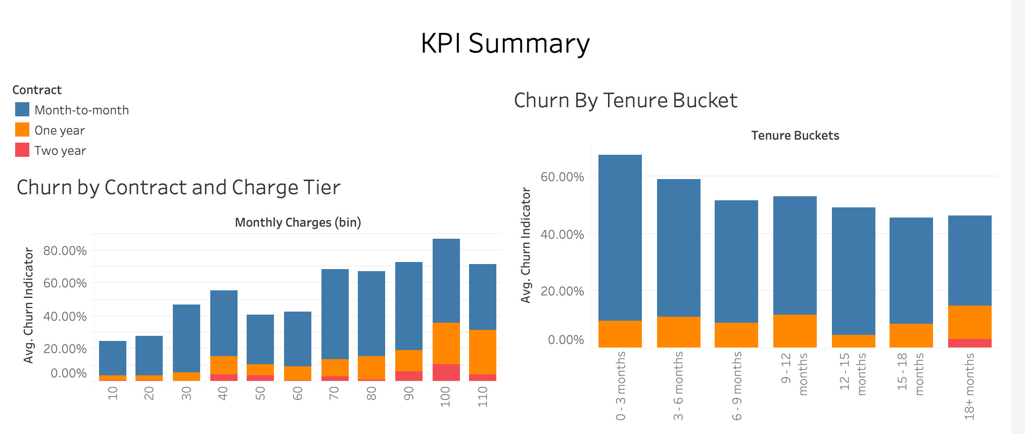
- Created new analytical dimensions like churn indicators, tenure buckets (0–3, 3–6, …, 18+ months), and custom charge tiers
- Used calculated fields to transform raw data into actionable metrics
Dashboard Design & Insight Discovery
- Developed KPI summary tiles (Churn Rate, Total Customers, Avg Tenure, Revenue)
- Built interactive visuals: churn by contract, tenure, ISP type, and monthly charges
- Applied color gradients and filters to highlight patterns and enable user-driven exploration
Skills Demonstrated
- Advanced dashboard design principles, carried from Excel into Tableau
- Calculated fields, dynamic filtering, and interactivity in Tableau
- Data segmentation and pattern discovery in customer churn analysis
- Visual storytelling for business insight and decision support
- Self-directed upskilling and tool expansion in BI and data visualization